Option 2: Make Your Own Adventure
It does not matter where you start only that you start. So, use colours you already have (or whatever your friends or teachers have suggested) and run them through the process. Then you can mix and match them again to find even more colours.
Here are some basic suggestions:
- Warm Colours – Cadmium Yellow Medium, Cadmium Red Medium, and Ultramarine Blue
- Cool Colours – Primary Yellow, Primary Magenta, and Primary Cyan
- Modern Colours – Lemon Yellow, Opera Pink, Phthalo Blue
- Surprise Mix – Golden Yellow, Quinacridone Violet, and Phthalo Green Blue Shade.
For your reference, Pigment Identification number are listed beside the colour name so you may look on the labels of your paint tubes to find similar pigment ID numbers. Pigments numbers are similar between watercolour, gouache, acrylic, and oils. So you have a lot of paint you likely have these basic colours already. You will notice only single-pigment colours are choose to make sure the colour mixes showcase clean and subtle mixes.
Pigment Lists
You may find these colours already in your collection. Scroll the list to find hint for where to find these pigments on other labels. Pigment Identification can be found on colour charts are available at your local art store too.
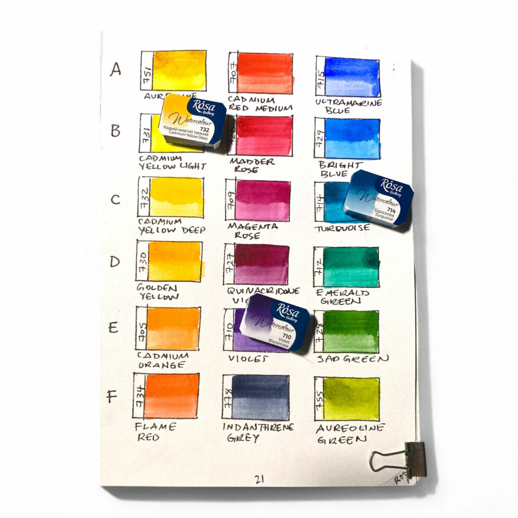
Set A
- 751 Aureoline [PY150]
- 707 Cadmium Red Medium [PR108]
- 715 Ultramarine Blue [PB29]
Set B
- 731 Cadmium Yellow Light [PY35]
- 726 Madder Rose [PV19]
- 729 Bright Blue [PB15:3]
Set C
- 732 Cadmium Yellow Deep [PY35]
- 709 PR22 Magenta Rose [PR22]
- 714 Turquoise [PB15:3, PG 7]
Set D
- 730 Golden Yellow [PY110]
- 727 Quinacridone Lilac [PV19]
- 712 Emerald Green [PG7]
Set E
- 705 Cadmium Orange [PY35]
- 710 Violet [PV23]
- 728 Sap Green [PY110, PG7, PBk6]
Set F
- 778 Indanthrene Grey [PB60]
- 755 Aureoline Green [PY150, PG7]
- 734 Flame Red [PO73]
Option 2: Make Your Own Adventure
It does not matter where you start only that you start. So, use colours you already have (or whatever your friends or teachers have suggested) and run them through the process. Then you can mix and match them again to find even more colours.
Here are some basic suggestions:
- Warm Colours – Cadmium Yellow Medium, Cadmium Red Medium, and Ultramarine Blue
- Cool Colours – Primary Yellow, Primary Magenta, and Primary Cyan
- Modern Colours – Lemon Yellow, Opera Pink, Phthalo Blue
- Surprise Mix – Golden Yellow, Quinacridone Violet, and Phthalo Green Blue Shade.
For your reference, Pigment Identification number are listed beside the colour name so you may look on the labels of your paint tubes to find similar pigment ID numbers. Pigments numbers are similar between watercolour, gouache, acrylic, and oils. So you have a lot of paint you likely have these basic colours already. You will notice only single-pigment colours are choose to make sure the colour mixes showcase clean and subtle mixes.
Pigment Lists
You may find these colours already in your collection. Scroll the list to find hint for where to find these pigments on other labels. Pigment Identification can be found on colour charts are available at your local art store too.
Set A
- 751 Aureoline [PY150]
- 707 Cadmium Red Medium [PR108]
- 715 Ultramarine Blue [PB29]
Set B
- 731 Cadmium Yellow Light [PY35]
- 726 Madder Rose [PV19]
- 729 Bright Blue [PB15:3]
Set C
- 732 Cadmium Yellow Deep [PY35]
- 709 PR22 Magenta Rose [PR22]
- 714 Turquoise [PB15:3, PG 7]
Set D
- 730 Golden Yellow [PY110]
- 727 Quinacridone Lilac [PV19]
- 712 Emerald Green [PG7]
Set E
- 705 Cadmium Orange [PY35]
- 710 Violet [PV23]
- 728 Sap Green [PY110, PG7, PBk6]
Set F
- 778 Indanthrene Grey [PB60]
- 755 Aureoline Green [PY150, PG7]
- 734 Flame Red [PO73]
Sometimes the theories about colour simply raise more questions than they answer. And many artists seek to move beyond basic theory to create a series of work in their own colour-story or colour-style.
ColourJot is here with a novel solution! Our templates will help you create attractive and useful references in your art journal to catalogue and compare colour mixing experiments. ColourJot art journals will become invaluable resource to help you select unique colour combinations to capture subject matter, locations, time of day, mood and more.
In a simple process, we’ll discovered 99 variations using just 3 colours.
“But, which three colours?” you may ask.
Here are some examples of my favourite colour-mixing discoveries:
- There are no neutrals in the ColourJot sets because we learn to make browns and earthtones in every colour grid.
- Green and crimson often makes a better purple than most blue/red combinations.
- Violet and Emerald can make a blue.
- Pink and yellow can make a red.
- Green and orange can make yellow ochre.
Option 1: Use ColourJot 18-Colour Sets
ColourJot has pre-selected a special selection of 18 Rosa Watercolours and curate them into six sets of 3-colours each. There are both primary and secondary colour mixing sets and no repeats. Run each set through the ColourJot colour wheel and colour grid to create some surprising results and yield lots of “WOW!” and “AHHA” moments along the way.
Option 2: Make Your Own Adventure
It does not matter where you start only that you start. So, use colours you already have (or whatever your friends or teachers have suggested) and run them through the process. Then you can mix and match them again to find even more colours.
Here are some basic suggestions:
- Warm Colours – Cadmium Yellow Medium, Cadmium Red Medium, and Ultramarine Blue
- Cool Colours – Primary Yellow, Primary Magenta, and Primary Cyan
- Modern Colours – Lemon Yellow, Opera Pink, Phthalo Blue
- Surprise Mix – Golden Yellow, Quinacridone Violet, and Phthalo Green Blue Shade.
For your reference, Pigment Identification number are listed beside the colour name so you may look on the labels of your paint tubes to find similar pigment ID numbers. Pigments numbers are similar between watercolour, gouache, acrylic, and oils. So you have a lot of paint you likely have these basic colours already. You will notice only single-pigment colours are choose to make sure the colour mixes showcase clean and subtle mixes.
Pigment Lists
You may find these colours already in your collection. Scroll the list to find hint for where to find these pigments on other labels. Pigment Identification can be found on colour charts are available at your local art store too.
Set A
- 751 Aureoline [PY150]
- 707 Cadmium Red Medium [PR108]
- 715 Ultramarine Blue [PB29]
Set B
- 731 Cadmium Yellow Light [PY35]
- 726 Madder Rose [PV19]
- 729 Bright Blue [PB15:3]
Set C
- 732 Cadmium Yellow Deep [PY35]
- 709 PR22 Magenta Rose [PR22]
- 714 Turquoise [PB15:3, PG 7]
Set D
- 730 Golden Yellow [PY110]
- 727 Quinacridone Lilac [PV19]
- 712 Emerald Green [PG7]
Set E
- 705 Cadmium Orange [PY35]
- 710 Violet [PV23]
- 728 Sap Green [PY110, PG7, PBk6]
Set F
- 778 Indanthrene Grey [PB60]
- 755 Aureoline Green [PY150, PG7]
- 734 Flame Red [PO73]