The key to success in building a good ColourJot reference book is having standardized numbering and labelling. During our in-person courses, we discovered that it was easier to keep track of the placement of colour mixes when the spaces were clearly marked. Writing the terms right on the page reinforces the learning.
How to label and number your ColourJot designs
On the ColourJot Circle:
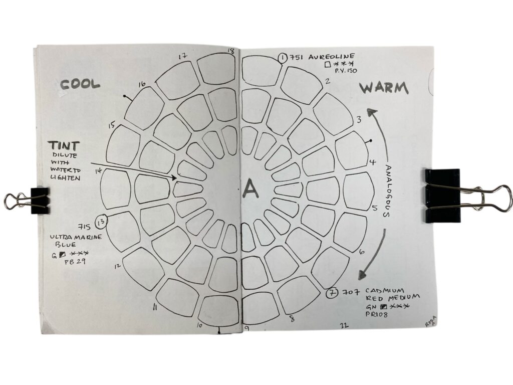
- Number the rays 1 – 18, Clockwise around the outside.
- Emphasize the prime spots of 1, 7, and 13 as the placement of the prime colours.
- Write the name and rating for each to include Pigment ID, lightfastness, transparency (and even price group, if you wish).
- Mark the halfway point between the two colours being mixed.
- Mark an arrow around the outside as ‘Analogous’.
- Label the arrow pointing towards the centre and ‘Tint’.
- On the left side of the colour circle, write the word ‘Warm’.
- On the right side of the colour circle, write the word ‘Cool’.
- Here are three design suggestions. If you create your own version, please share it on social media as #colourjot.
On the ColourJot Grid
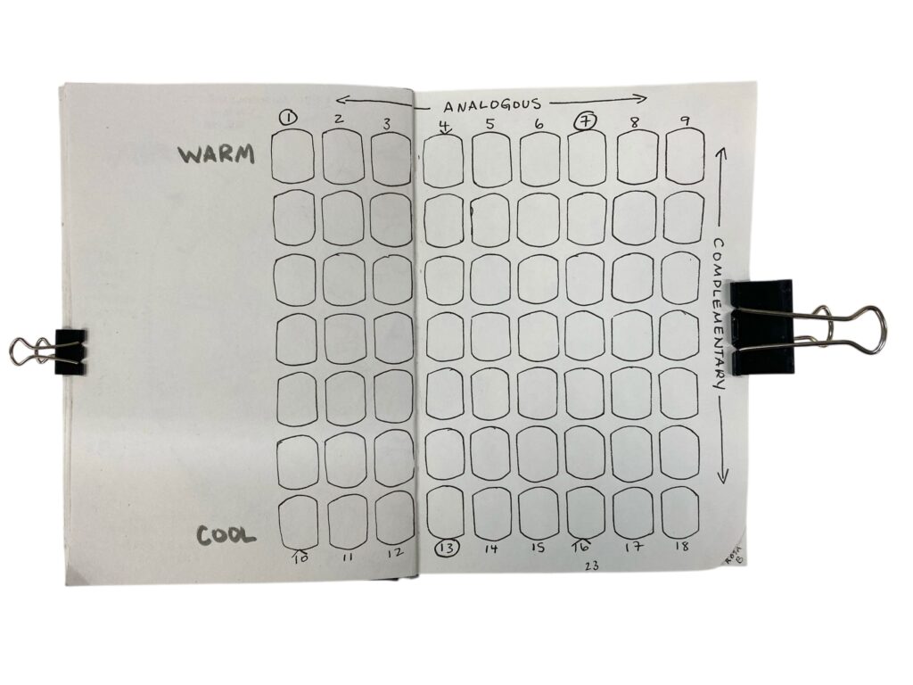
- Number the top 1 – 9
- Write ‘Warm’ on the top since these will be warm colours.
- Number the bottom 1 – 18
- Write ‘Cool’ at the bottom since these will be cool colours.
- Write ‘Analogous’ along the top.
- Write ‘Complementary’ down the side.
It is recommended to always note the colour names and rating, but as you process through the colour sets and create more ColourJots, you may likely skip the numbers and repetitive words. Instead, you may choose to use the space to track notes of favourite colours and how you’re inspired to use them in your paintings.