This is a glossary of the most common terms used when teaching and learning about colour. It is by no means an exhaustive list, but it is relevant information for colour theory for visual artists. The images provided are helpful references, and there are many links to more information.
Additive Colour Mixing
Combining colours of light (not pigment) to create new colours. This is rarely used in traditional art but helps explain the concept of overlapping transparent layers. Like why violet neutralizes yellow in hair dye, or teeth whitening. However, artists do not paint with light; we are mere mortals. Our pigments and dyes are physical and made from the earth, plants, animals, or modified in labs. We are mere humans, not gods, so we cannot paint in light using traditional art materials from the physical world. However, it is fascinating, so read all about Additive colour here. https://en.wikipedia.org/wiki/Additive_colour
Arbitrary Colours
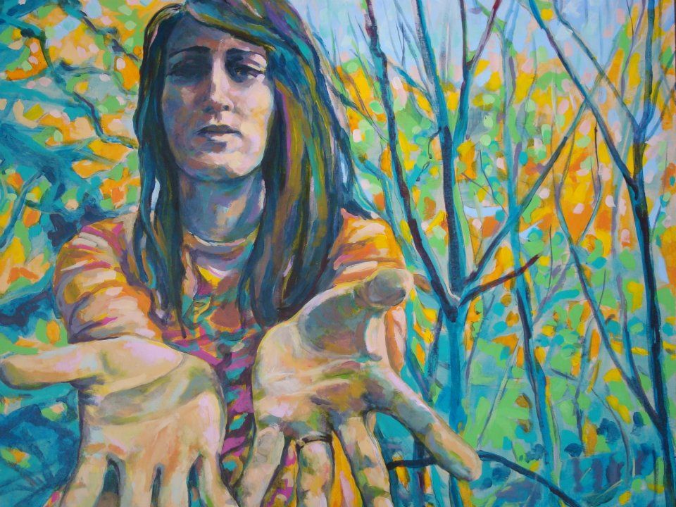
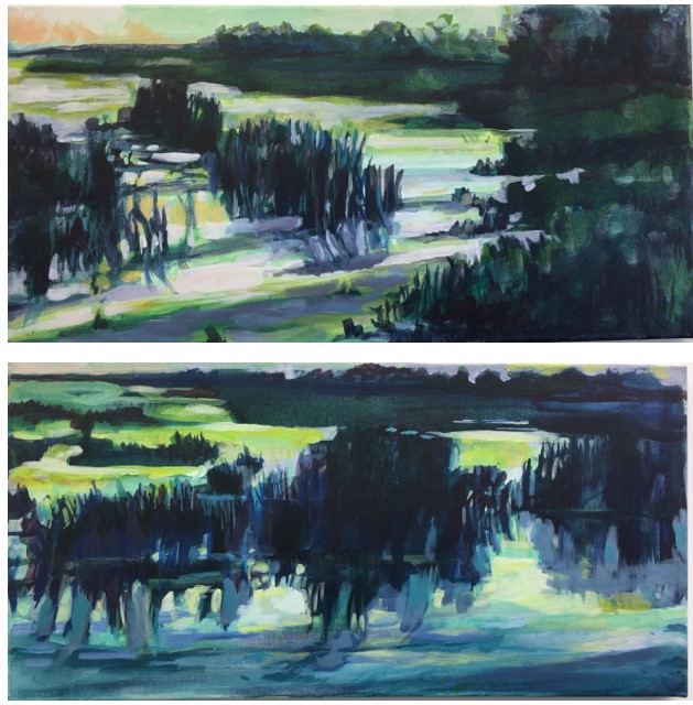
Picking colours that do not necessarily represent local colour or realistic colour is called arbitrary. These colours may have been chosen by the artist to express feelings, personal preference, symbolism, or novelty.
For example, the colours chosen for this image by Kim Fjordbotten were selected because the artist wanted the challenge of using the newest colours available. Notice that we see primarily light and dark versions of the colour, and there is very little mixing between the colours. The colours are not traditional portrait or landscape colours, so the viewer may be intrigued or engage differently with the painting.
ASTM
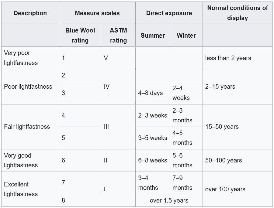
The American Society for Testing and Materials (ASTM) was established recently to conduct tests on the durability of artists’ colour pigments (equivalent to 20 years of exposure in a gallery). Their tests represent the most absolute classification in use for painting materials, and ASTM codes are employed by all manufacturers of fine art paints to identify their colours in terms of lightfastness and permanence, as follows: ASTM 1: excellent lightfastness. ASTM II: very good lightfastness. ASTM III: Not sufficiently lightfast. 4-Star or AA: Extremely permanent paint colours. 3-Star or A: Durable pigments, generally sold as permanent. 2-Star or B: Moderately durable colours. 1-Star or C: Fugitive colours. Wikipedia source
Achromatic
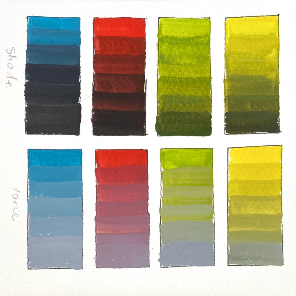
A term used to describe having no colour hue, pure black, pure white, or a neutral gray. These non-colours can modify colour without changing temperature. Shade means to add black to a colour. Tone means to add grey to a colour. Both will reduce the intensity of a colour without shifting it out of its hue family.
Analogous colours
Any set of three or five colours that are closely related in hue and usually found next to each other on the colour wheel, such as blue, blue-green, and green. These are often used to create serene compositions. Likewise, red, orange, and orange-yellow are warm and exciting. Analogous colours can also be made from Blue, Violet, and Red, or Green, Yellow, and Orange. In this way, warm and cool colours provide variety and depth. Utilizing only a small portion of the colour wheel is often used in cinema to create an intentional mood for a scene. Artists can use this in painting as well. The image here shows a cool summer evening with greens, blues, and purples.
Atmospheric Perspective
This is one way to convey space and depth in a painting. Objects appear lighter, less intense, and details are blurred when seen from far away. A painter can convey depth by subduing the brightness and intensity of a colour. This is done by diluting the colour or lightening it with white to make distant objects less intense. Atmospheric perspective is obvious in mist, fog, where far-away items are covered in white. Bright sunlight can also wash out colours on items far away. Even on a normal cloudy day, we look through a lot of atmosphere to view distant landscapes, and often there is a bluing effect.
Bleed
When paint or ink runs into an adjoining area or up through coats of paint. This is a common technique for colour mixing that allows for the free-form combining of colours in a loose painting style.
Blending
The manual mixing of colour, either on the palette or directly on the painting, is called blending. Literally, it means to push colours with a brush or stir them together to combine a new colour. Blending can also refer to how artists blur the edges between colours by softening colours with a brush until there is no hard line between them. Dry brush blending is often called scumbling.
Brilliance
This term refers to the cleanness and brightness of a colour, specifically the absence of muddy tones. Clean, bright, luminance, and glowing also refer to brilliance. Artist-quality colours have more brilliance than student quality.
Brilliance is similar to, but not the same as, intensity and saturation because some colours look more brilliant when applied thinly or diluted.
Brightness
The perception of how light or dark a colour appears, influenced by the amount of white or black mixed with it. It is tricky to separate brightness, saturation, intensity, and tinting strength because pigments may possess these qualities in different situations and colour mixing. For example, Phthalo Blue and Dioxazine Violet have high tinting strength, but their mass tones appear low brightness.
Broken Colour
A painting technique where distinct dabs of separate, unmixed colours appear to blend optically when viewed from a distance. Introduced by Impressionist painters (notably Neo-Impressionists), whereby colours on the canvas are made up of small flecks and dashes of paint. And when seen from a distance, the colours blend and retain a vibrant, luminous quality.
Other examples of broken colour include dry brush, scumbling, and pointillism. The painters create visual texture to create the look of fur, weathered wood, and coarse fabrics.
Burnt Colours
Colours that appear muted or “scorched,” often created by mixing complementary colours to neutralize each other. Burnt also refers to Raw Sienna vs Burnt Sienna, or Raw Umber and Burnt Umber. Heating the pigments makes the colours darker.
Chromaticity
This is commonly known as “colourfulness”. Chroma is the amount of identifiable hue in a colour. A colour without hue is achromatic or monochromatic and will appear grey. Highly chromatic colours contain maximum hue with few impurities or additives such as white, grey, or black. A colour without hue is called “achromatic” or “monochromatic” and appears grey.
Colour
The appearance of pigmentation of objects resulting from the light they reflect. Colours are traditionally classified as “primary” (red, blue, yellow), “secondary” – all other colours obtainable by mixing primaries. Depending on their optical effect, they are grouped into warm, cool, and neutral colours.
Colour permanence (Lightfastness)
Describes the durability/permanence of a pigment: that is, its resistance to fading on exposure to light. This depends chiefly on the chemical composition of the colour pigment. But some colours, which are lightfast at full strength, lose their resistance when strongly diluted or combined with white.
Colour value
The lightness or darkness of a colour; low value is dark; high value is bright.
Colour wheel
A circular diagram showing the relationships between primary, secondary, tertiary, and complementary colours. An indispensable tool for anyone working with colour. It is from the colour wheel that colour schemes are defined. Usually, it comprises three primary colours, three secondary colours, and six tertiary colours.
Complementary colours
These colours sit directly opposite each other on the colour wheel: such as blue and orange, red and green, and violet and yellow. Each primary colour – red, yellow, blue – has its own, exclusive, complementary colour – green, purple, orange. These are made by mixing the other two primaries. When the corresponding pair of primary and complementary colours is placed side by side, they cause an optical vibration in the eye and activate each other.
Complementary colours are found opposite to each other on the colour wheel and have several useful purposes.
First, complementary colours are high contrast and show well together. Common colour pairings are: Red and Green, Blue and Orange, or Purple and Yellow.
Second, when mixed, complements will subdue or darken the purity of a colour. If you seek to make a colour appear to be in shadow, try mixing in a little of its complement.
Third, complements will modify the temperature of a colour to pull it from a warm towards a cool. For example, if you were painting an apple, the bright red can smoothly transition over to green.
Lastly, bright, intense, or warm colours come forward, and dull colours recede. So, complements provide the painter with the ability to shift a colour to a cooler tone to help it appear more in the background than other objects. Example: take a pile of grapes. The bright ones will jump off the page, and the duller ones will recede behind the bright colours.