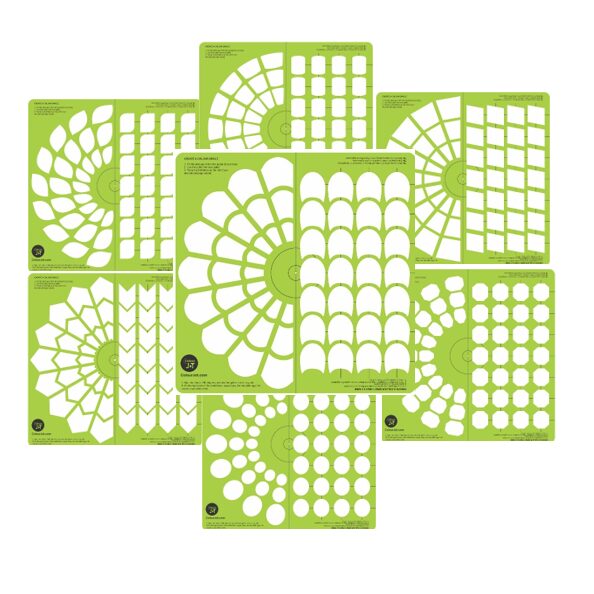
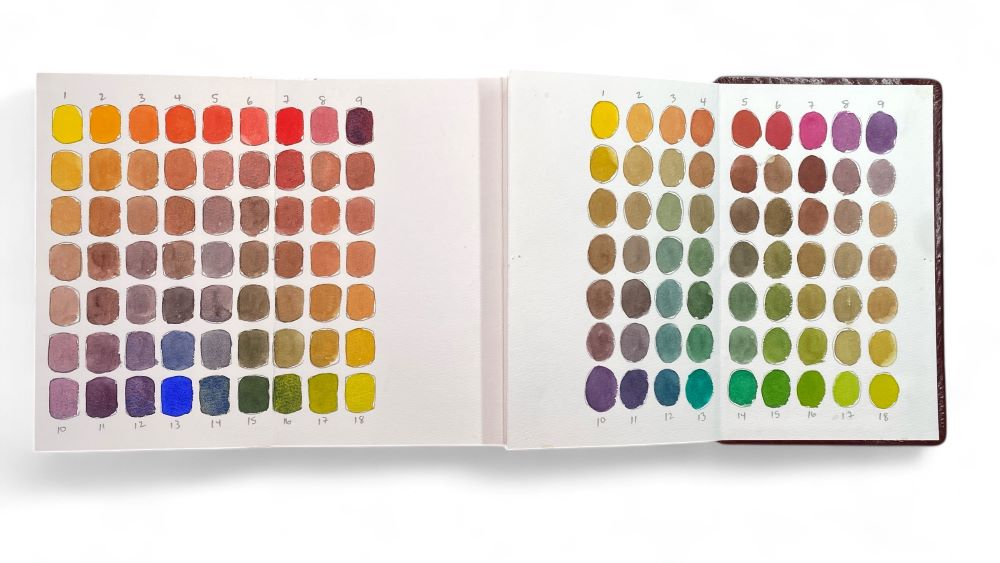
Teaching colour theory often requires moving beyond the traditional, static colour wheel. If you want your students to truly understand how pigments interact, they need a hands-on approach. Enter the #ColourJot grid template. This tool features a unique swatching layout designed to help artists of all levels document and understand their paint mixtures.
Whether you teach beginners or advanced painters, the #ColourJot grid template offers an organized, visually satisfying way to track colour experiments. It gives your students a clear framework to see exactly how base colours transform when altered. By using this tool, you can help your class build a comprehensive reference library of custom shades.
In this post, we will explore five foundational ways to modify colours using the #ColourJot grid template. We will also look at practical examples you can use to bring colour theory for art instructors directly into your classroom.
5 Ways to Modify Colours Using the #ColourJot Grid Template
The unique swatching layout of the grid allows students to isolate changes and observe subtle shifts in hue, value, and saturation. Here are five essential mixing techniques to guide your students through.
1. Add Water: Exploring Transparency and Washes
Adding water is the simplest way to alter a water-based pigment, yet it opens up a massive range of possibilities. When students add varying amounts of water to their base colour on the #ColourJot grid template, they dilute the pigment. This extends the paint, lightens the value, and creates beautiful washes.
Water also adds transparency. This allows the white of the paper—or underlying colours—to shine through. You can teach students to use this technique for establishing undertones or lifting paint to create a highlight.
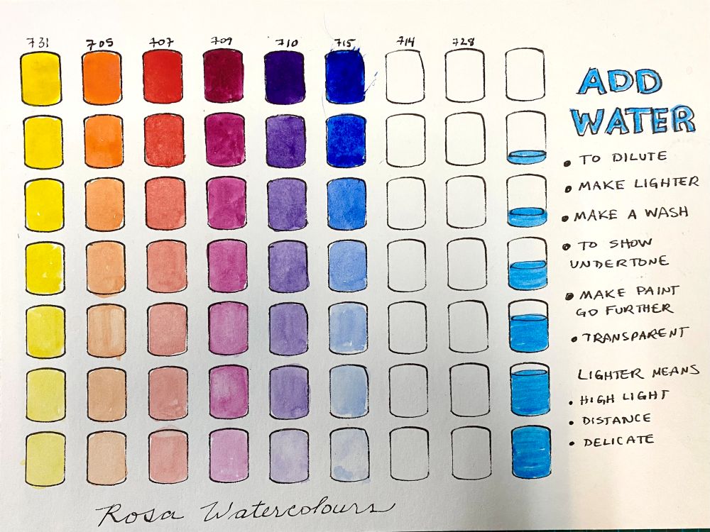
Painting Practice Example: Ask your students to create a soft watercolour background. Have them swatch a heavily saturated blue at the top of their grid. As they move down the swatching layout, instruct them to add slightly more water to each subsequent square. This exercise teaches them how to achieve a luminous, gradual fade that works perfectly for painting clear skies or calm bodies of water.
2. Add White: Building Volume and Atmosphere
Introducing white paint allows students to explore tints. Adding white lightens the base colour while simultaneously adding opacity. This makes it an incredibly useful tool for making corrections over mistakes or blocking in solid highlights.
White also softens harsh tones. It helps colours recede visually, which is vital for creating depth in a composition. By swatching progressive tints on their grid, students learn exactly how much white they need to achieve a specific level of softness.
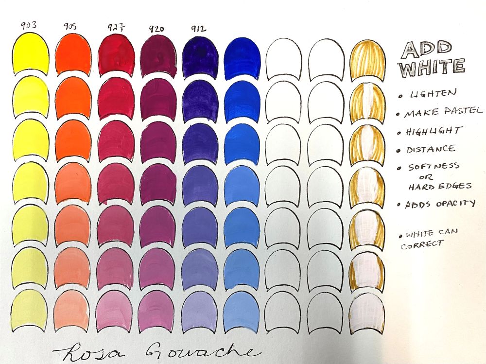
Painting Practice Example: Show your students how to paint misty landscapes or soft clouds. Have them mix a dark green or blue, then slowly add increments of white paint on their #ColourJot template. They will see how the colour transitions from a bold foreground shade to a pale, misty background hue. You can also use this exercise to demonstrate how adding white helps create the illusion of volume on a rounded shape.
3. Add Black: Creating Shadows and Drama
While some artists avoid black paint, teaching students how to use it properly unlocks a new level of depth in their work. Adding black creates shades. It darkens the base colour, dulls overly bright pigments, and introduces heavy contrast.
Using the #ColourJot grid template helps students control black paint. Because black can quickly overpower weaker colours, the structured swatching layout forces students to add it in tiny, measurable increments. This prevents them from ruining their mixtures.
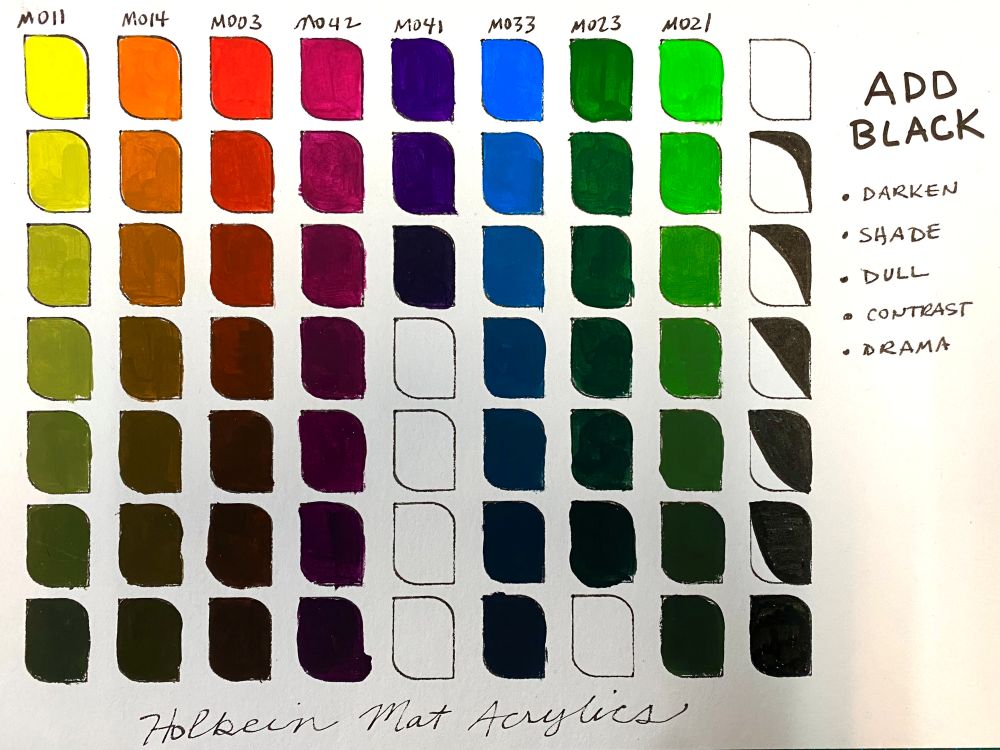
Painting Practice Example: Use this technique to teach dramatic chiaroscuro effects. Have your class paint a simple still life of an apple. Ask them to use their grid to mix three distinct shades of their base red by adding tiny touches of black. They can then use these custom shades to paint deep, convincing shadows that give the apple weight and anchor it to the table.
4. Complementary Mixing: Achieving Harmonious Neutrals
Complementary mixing is one of the most vital skills in painting. When students mix colours that sit opposite each other on the colour wheel, they reduce the intensity of both pigments. This creates complex, beautiful neutrals rather than muddy messes.
You can use the grid to show how complementary mixing smoothly transitions a warm colour into a cool colour. It also creates rich greys and browns. Mixing these complementary pairs establishes a harmonious colour family that unifies an entire painting.
Painting Practice Example: Instruct your students to mix blue and orange. Have them place pure blue on one side of their #ColourJot grid and pure orange on the other. Instruct them to slowly mix the two toward the middle of the grid. They will discover a beautiful, muted grey in the centre. This grey is perfect for painting balanced, natural shadows that do not look flat or artificial.
5. #ColourJot Colour Dating: Discovering Unexpected Matches
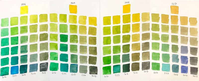
Colour dating is a fun, engaging exercise that encourages pure experimentation. The rules are simple: pick any two random colours from your palette and mix them to see what happens. This removes the pressure of painting a specific object and allows students to focus entirely on exploring colour relationships. The #ColourJot grid template provides the perfect space for colour dating. Students can log their favourite “dates” and keep the swatches for future reference. This builds their confidence and expands their personal colour vocabulary.
The sample below show 4 different yellows mixed with 4 different blue-greens. Discuss with students how lemon-yellow makes brighter greens compared to orange-yellow that make forest greens and olive greens.
Why the #ColourJot Grid Template is Perfect for Teaching Colour Theory
Teaching colour theory requires tools that make abstract concepts visible. The #ColourJot grid template does exactly that. It transforms the messy, unpredictable process of mixing paint into a clear, visual science.
For art instructors, the structured swatching layout acts as a built-in lesson plan. It guides students through logical progressions of colour without overwhelming them. When students can visually reference how a colour behaves when modified with water, white, black, or its complement, they stop guessing. They start making intentional, educated decisions about their palettes.
Furthermore, the physical act of filling out the grid builds muscle memory. Students learn exactly how much medium or pigment they need to scoop onto their brush to achieve the results they want. This repetition solidifies their understanding of colour theory far better than reading a textbook or staring at a printed colour wheel.
Start Exploring Colour Relationships Today
The #ColourJot grid template is more than just a piece of paper; it is a dedicated workspace for artistic growth. By incorporating these five exercises into your curriculum, you can make teaching colour theory an engaging, highly anticipated part of your art instruction.
Give your students the tools they need to unlock their full creative potential. Try using the #ColourJot grid template in your next class or personal painting session. We would love to see the unique palettes and colour dates you and your students discover. Share your filled-out swatching layouts and classroom results online using the hashtag #ColourJot!